
MUI AppBar For Top-Level Navigation In React
In this guide, we’ll delve into the powerful Material-UI AppBar component to create seamless top-level navigation bars in your React applications. Learn to integrate dynamic links, implement responsive design, and enhance user experience effortlessly.
Installation and Setup
Ensure you have Material-UI installed in your React project. Import the necessary components, including AppBar, Toolbar, IconButton, Typography, Menu, Container, MenuItem, and Button. This sets the stage for building a robust navigation bar.
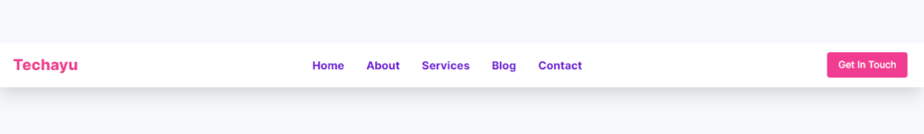
Desktop design
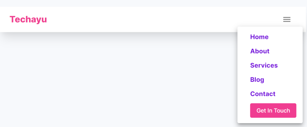
Mobile design
import React from "react";
import Link from "next/link";
import { AppBar,Box,Toolbar,IconButton,Typography,Menu,Container,MenuItem, Button, } from "@mui/material";
import MenuIcon from "@mui/icons-material/Menu";

const css = {
  mx: 2,
  color: "#6F10D9 ",
  display: "block",
  fontWeight: 700,
  fontSize: 16,
  fontFamily: " 'Inter', sans-serif",
  textDecoration: "none",
  "&:hover": {
    color: "#9B63DC",
  },
};
const btncss = {
  fontFamily: " 'Inter', sans-serif",
  letterSpacing: "normal",
  px: 2,
  ml: 2,
  color: "#fff",
  backgroundColor: "#F03D91  ",
  "&:hover": { backgroundColor: "#BB1161" },
     textTransform: "none",
};

const navItems = [
  { text: "Home", href: "/" },
  { text: "About", href: "/about" },
  { text: "Services", href: "/services" },
  { text: "Blog", href: "/blog" },
  { text: "Contact ", href: "/contact" },
];

const NavBar = () => {
  const [anchorElNav, setAnchorElNav] = React.useState(null);
  const handleOpenNavMenu = (event) => {
    setAnchorElNav(event.currentTarget);
  };
  const handleCloseNavMenu = () => {
    setAnchorElNav(null);
  };

  return (
      <AppBar
        position="static"
        sx={{
          backgroundColor: "#fff",
          boxShadow:
            "rgba(0, 0, 0, 0.1) 0px 20px 25px -5px, rgba(0, 0, 0, 0.04) 0px 10px 10px -5px",
        }}
      >
        <Container maxWidth="xl">
          <Toolbar disableGutters>
            {/* --------------------------------logo------------------------------------- */}
            <Typography
              sx={{
                fontWeight: 800,
                fontSize: 22,
                fontFamily: " 'Inter', sans-serif",
                color: "#F03D91  ",
              }}
            >
              Techayu
            </Typography>
            <Box sx={{ flexGrow: 1, display: { xs: "flex", md: "none" } }}>
              <Menu
                id="menu-appbar"
                anchorEl={anchorElNav}
                anchorOrigin={{
                  vertical: "bottom",
                  horizontal: "left",
                }}
                keepMounted
                transformOrigin={{
                  vertical: "top",
                  horizontal: "left",
                }}
                open={Boolean(anchorElNav)}
                onClose={handleCloseNavMenu}
                sx={{
                  display: { xs: "block", md: "none" },
                }}
              >
                {navItems.map((item, index) => (
                  <MenuItem key={index} onClick={handleCloseNavMenu}>
                    <Typography
                      textAlign="center"
                      component={Link}
                      href={item.href}
                      sx={css}
                    >
                      {item.text}
                    </Typography>
                  </MenuItem>
                ))}
                <MenuItem onClick={handleCloseNavMenu}>
                  <Button
                    sx={btncss}
                    component={Link}
                    href="/contact"
                  >
                    Get In Touch
                  </Button>
                </MenuItem>
              </Menu>
            </Box>

            <Box sx={{ display: { xs: "flex", md: "none" } }}>
              <IconButton
                size="large"
                aria-label="account of current user"
                aria-controls="menu-appbar"
                aria-haspopup="true"
                onClick={handleOpenNavMenu}
              >
                <MenuIcon />
              </IconButton>
            </Box>
            <Box
              sx={{
                flexGrow: 1,
                display: { xs: "none", md: "flex" },
                alignItems: "center",
                justifyContent: "center",
                textAlign: "center",
              }}
            >
              {navItems.map((item, index) => (
                <Typography
                  key={index}
                  onClick={handleCloseNavMenu}
                  sx={css}
                  component={Link}
                  href={item.href}
                >
                  {item.text}
                </Typography>
              ))}
            </Box>
            <Box sx={{ flexGrow: 0, display: { xs: "none", md: "flex" } }}>
              <Button
                component={Link}
                href="/contact"
                sx={btncss}
              >
                Get In Touch
              </Button>
            </Box>
          </Toolbar>
        </Container>
      </AppBar>

  );
};
export default NavBar;
Creating a Responsive Navigation Bar
Utilize the provided navItems array to define your navigation links. The NavBar component incorporates responsive design by adapting the layout for both small and medium screens. The menu icon triggers a dropdown for smaller screens, while a horizontal layout is maintained for larger screens.
Customizing the AppBar
Explore the AppBar’s customization options, including background color, shadow, and typography. The css object defines styling for navigation links, ensuring a visually appealing and user-friendly design.
Handling Menu Interactions
The Menu component facilitates the dropdown menu on smaller screens. Dynamically generate menu items based on the navItems array, and utilize the handleOpenNavMenu and handleCloseNavMenu functions for seamless menu interactions.
Enhancing User Interaction
Implement smooth transitions and hover effects on navigation links to enhance user interaction. The Button component serves as a prominent “Get In Touch” call-to-action button, guiding users to a specific page.
Conclusion: Elevate Navigation with MUI AppBar
Mastering Material-UI AppBar empowers you to create sophisticated top-level navigation bars in your React applications. This guide provides a solid foundation for building responsive, visually appealing, and user-friendly navigation experiences.
Feel free to customize the code, experiment with additional features, and tailor the AppBar to match the unique design requirements of your React project. Elevate your navigation game with Material-UI and deliver an exceptional user experience.
All Related Posts
- MUI Table Integration, Pagination, & Excel Export
- How To Use MUI Grid For Responsive Web Layouts
- How To Create A Multiform In MUI And Next Js?
- Material-UI Typography: React Text Styling Guide
- Next.Js And Material UI: Building A Login Page
- How To Create Contact Form With MUI In React
- How To Use Material UI Forms
- MUI Card Components: Elevate Your React UI Design
- How To Use Material-UI Cards