
MUI Card Components: Elevate Your React UI Design
In the ever-evolving landscape of React development, crafting visually appealing and organized user interfaces is paramount. Material-UI, a popular React UI framework, offers a powerful arsenal of components, and among them, the versatile “Card” component stands out as a cornerstone for presenting content elegantly. In this guide, we’ll explore how to leverage MUI Card to create stunning UIs effortlessly.
Understanding Material-UI Cards
Material-UI Cards serve as dynamic containers, allowing developers to encapsulate and display various types of content. From text and images to buttons and icons, Cards provide a flexible and visually pleasing way to organize information. Let’s delve into the intricacies of the Card component used in a React application.
Installation and Setup
Before diving into the details, ensure you have Material-UI installed in your React project. Import the necessary components, including CardMedia, Grid, Box, Typography, and Container. This establishes the foundation for utilizing Material-UI Cards effectively.
// Import necessary Material-UI components
import React from "react";
import {
  CardMedia,
  Grid,
  Box,
  Typography,
  Container,
  Stack,
} from "@mui/material";
Data Handling with Material-UI Cards
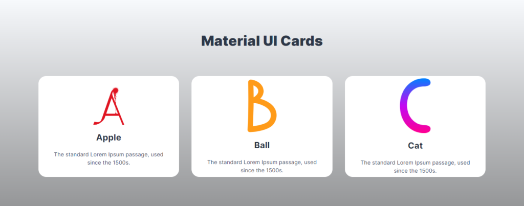
The provided React component demonstrates the use of Material-UI Cards by populating them with dynamic data. The Data array contains objects representing different cards, each with a unique id, name, image, and dec (description). This allows for dynamic and efficient handling of diverse content.
const Data = [
  {
    id: 1,
    name: "Apple",
    image: "/a.png",
    dec: `The standard Lorem Ipsum passage, used since the 1500s.`,
  },
  {
    id: 2,
    name: "Ball",
    image: "/b.png",
    dec: `The standard Lorem Ipsum passage, used since the 1500s.`,
  },
  {
    id: 3,
    name: "Cat",
    image: "/c.png",
    dec: `The standard Lorem Ipsum passage, used since the 1500s.`,
  },
];
Customizing the Card Structure
The structure of each Card is meticulously designed for a clean and modern appearance. From background gradients to typography choices, every element is thoughtfully crafted. The use of a Stack component within the Card allows for seamless alignment and positioning of various elements, creating a harmonious visual experience.
 import React from "react";
 import { CardMedia,Grid,Box,Typography,Container,Stack } from "@mui/material";

const Card = ({Data}) => {
  return (
    <>
      <Box
        sx={{
          background:
            'linear-gradient(to top, rgba(0,0,0,0.4) 0%, rgba(0,0,0,0) 100%), url("/") center/cover no-repeat',
        }}
      >
        <Container sx={{ my: { xs: 2, sm: 8 }, py: 10 }} maxWidth="lg">
          <Typography
            align="center"
            sx={{
              fontFamily: "'Inter', sans-serif",
              fontWeight: 900,
              fontSize: { xs: 24, sm: 36 },
              color: "#2D3748",
              mb: 8,
            }}
          >
            Material UI Cards
          </Typography>

          {/* Grid Container */}
          <Grid
            container
            spacing={4}
            justifyContent="center"
            alignItems="center"
          >
            {Data.map((item, index) => (
              // Individual Card
              <Grid item xs={12} sm={6} md={4} key={index}>
                <Box
                  sx={{
                    display: "flex",
                    width: "auto",
                    height: 260,
                    backgroundColor: "#ffffff",
                    borderRadius: 5,
                    alignItems: "center",
                    justifyContent: "center",
                  }}
                >
                  {/* Stack for Card Content Alignment */}
                  <Stack
                    justifyContent="center"
                    alignItems="center"
                    sx={{ width: "auto" }}
                  >
                    {/* Card Media (Image) */}
                    <CardMedia
                      component="img"
                      alt={item.name}
                      image={item.image}
                      sx={{
                        width: 80,
                      }}
                    />

                    {/* Card Title */}
                    <Typography
                      sx={{
                        my: 2,
                        color: "#2D3748",
                        fontFamily: "'Inter', sans-serif",
                        fontSize: 22,
                        fontWeight: 700,
                      }}
                    >
                      {item.name}
                    </Typography>

                    {/* Card Description */}
                    <Typography
                      sx={{
                        color: "#2D3748",
                        fontSize: 14,
                        fontFamily: "'Inter', sans-serif",
                        mx: 5,
                        textAlign: "center",
                        color: "#34495E",
                        fontWeight: 700,
                      }}
                    >
                      {item.dec}
                    </Typography>
                  </Stack>
                </Box>
              </Grid>
            ))}
          </Grid>
        </Container>
      </Box>
    </>
  );
};

export default Card;
Responsive Design with Grid System
Material-UI’s Grid system is employed to ensure a responsive layout, making the cards adapt gracefully to different screen sizes. Each card is strategically placed within the grid, maintaining a visually balanced presentation.
Theming and Styling
The guide touches on theming and styling, showcasing how to customize the appearance of Material-UI Cards to align with the overall design of your application. Explore color schemes, fonts, and additional styling options to match your unique visual identity.
Conclusion: Elevating Your UI with Material-UI Cards
Material-UI Card components offer a seamless solution for presenting content in a structured and visually appealing manner. By following this guide, you can harness the power of Material-UI Cards to create modern, responsive, and aesthetically pleasing user interfaces in your React projects.
Experiment with different data, explore additional styling options, and tailor Material-UI Cards to meet the specific needs of your application. With this knowledge, you’re well-equipped to elevate your React UI design with Material-UI Cards.
All Related Posts
- MUI Table Integration, Pagination, & Excel Export
- How To Use MUI Grid For Responsive Web Layouts
- How To Create A Multiform In MUI And Next Js?
- Material-UI Typography: React Text Styling Guide
- Next.Js And Material UI: Building A Login Page
- How To Create Contact Form With MUI In React
- How To Use Material UI Forms
- MUI AppBar For Top-Level Navigation In React
- How To Use Material-UI Cards